Self-Initiated
Agency
–
Date
2012
Role
- Art Direction
- Graphic Design
Artistic expression through digital experimentation
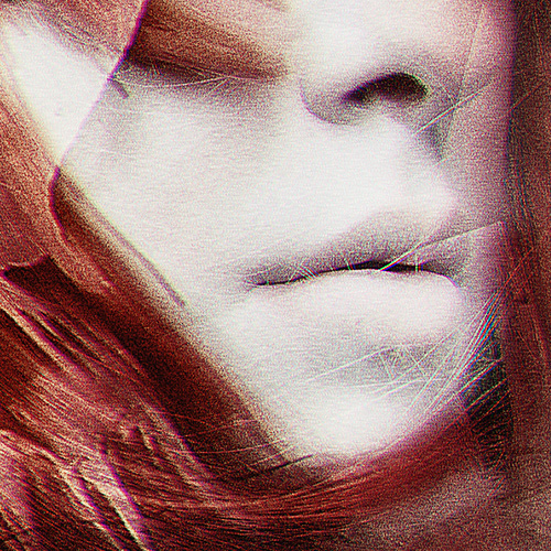
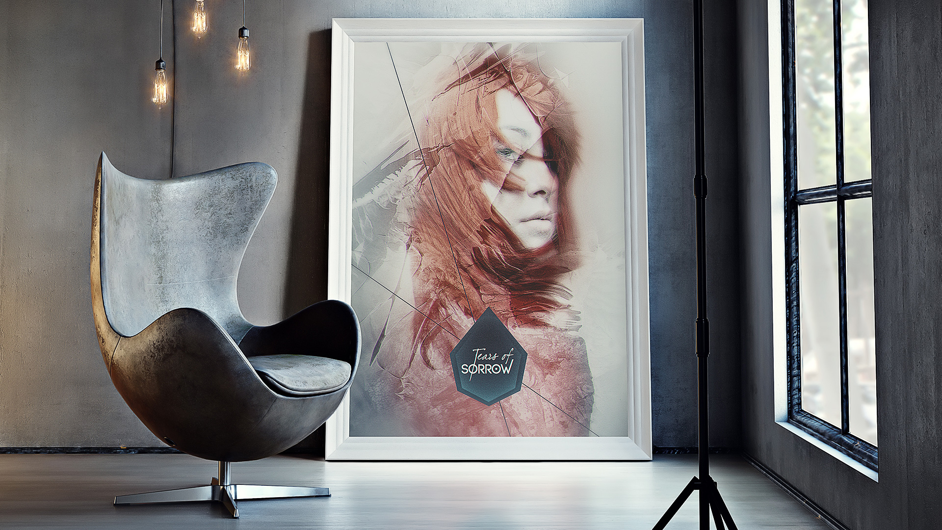
Tears Of Sorrow™ is part of my collection of personal artworks that i’ve crafted. I love once in a while to explore different ways of artistic expression, experiment new techniques, especially mix various kind of materials and textures.
Silent tears hold the loudest pain
For this artwork entitled Tears Of Sorrow™, my main idea was to portray a person struck by an intense sadness.
As if someone was stuck in a melancholy state of mind without knowing the reason and how to end it.
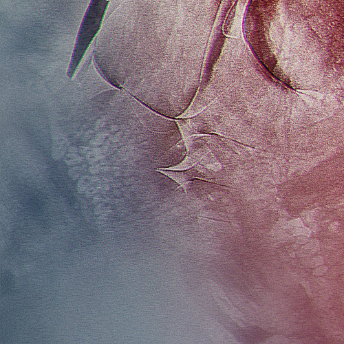
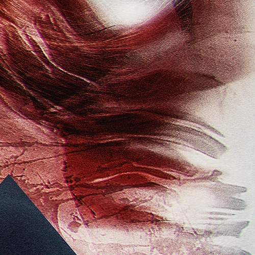
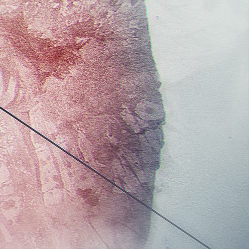
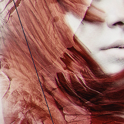
The warm colors, illustrating the last pieces of remaining joy, are vanishing into cold colors which represent the pervasive sadness. The smoothness and tenderness of the subject face is wrapped in a red blazing hair which is aimed to evoke a rain of blood and pain. In contrast, the blue tones are textured with some really frozen and sharp materials.
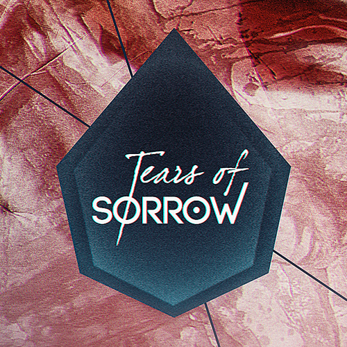
The logotype can be breakdown into two parts:
- “the Tears of” part has a calligraphic font type evoking the liquid substance of the tears and the emotive fragility of the subject.
- the “sorrow” part has a strong fon type with all upper-case letters, to reinforce the strength of the word itself.
At the end, all of it is embedded in a geometric shape, aimed to recall a giant tear drop.
Details matter
Digital canvas close-ups